LXQt 1.1.0 Preview second part
A - mostly visual - overview of the changes and new features added to LXQt after the first preview post.
LXQt 1.1.0 will be released in the second half of April.
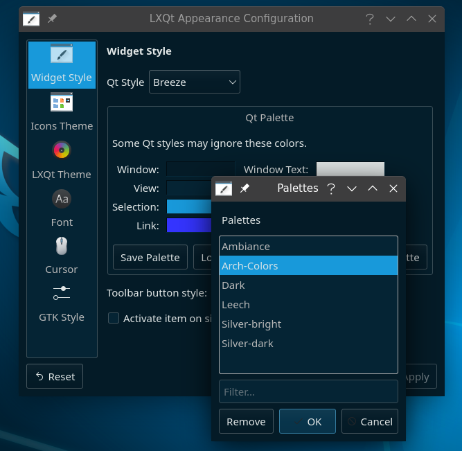
Dark default palettes
Color palettes matching the available dark themes have been added, making it easier to achieve an uniformed overall look. For light themes the Qt “Default Palette” is mostly suitable. The “System” theme will apply palette colors everywhere.
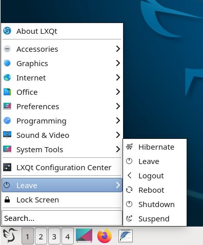
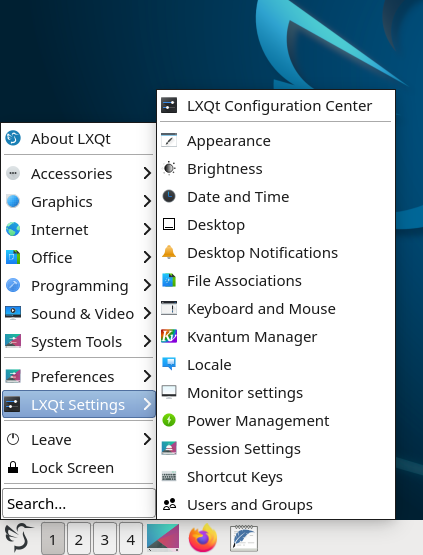
Menu choices
Two new menu layouts are added in the main menu configuration, Simple and Compact. Both will expand only over two panes.
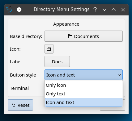
Directory Menu
Settings of this panel widget are improved:
Enhanced Colorpicker
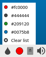
Useful for web design, the colorpicker panel widget has now a list with the last saved colors:
GTK Style
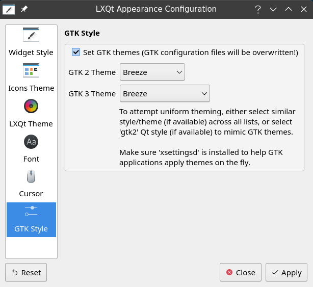
The GTK style settings are moved to an separate panel:
Improved default settings
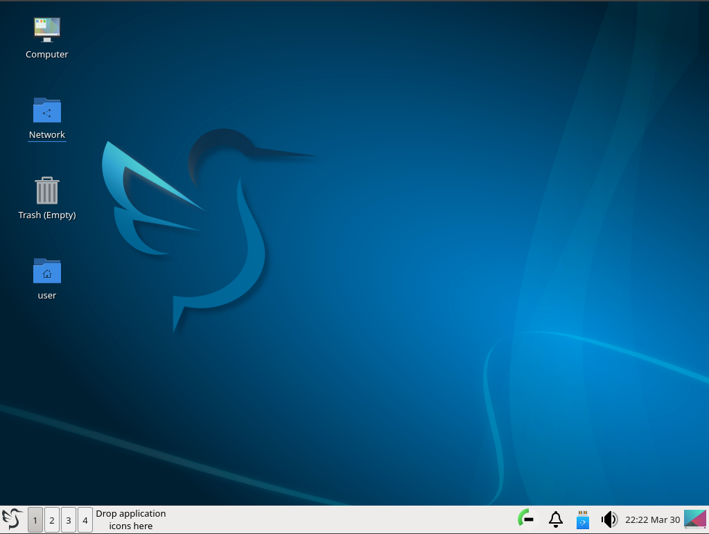
Mostly distributions will ship their own settings, but nevertheless we improved the default look.
- Main menu search is cleared after action
- Taskbar buttons width is reduced
- Home, network, computer and trash are shown by default on the desktop
- Changed default theme, wallpaper and icons
This is how it looks:
Other changes
- The tray plugin can be used to display legacy xembed icons directly in the notification area. Some applications do not support yet the modern SNI protocol.
- Reset buttons are finally working in every panel and panel widget settings.
- QTerminals Bookmarks
- GUI improvements in lxqt-config-input and lxqt-config-session
- Possibility of multiple notification areas
- More translations, code cleanups and bug fixes.
For the complete list of changes see the changelog files of the components once released.
